│By Ben Wilkinson-Turnbull, Gale Ambassador at the University of Oxford│
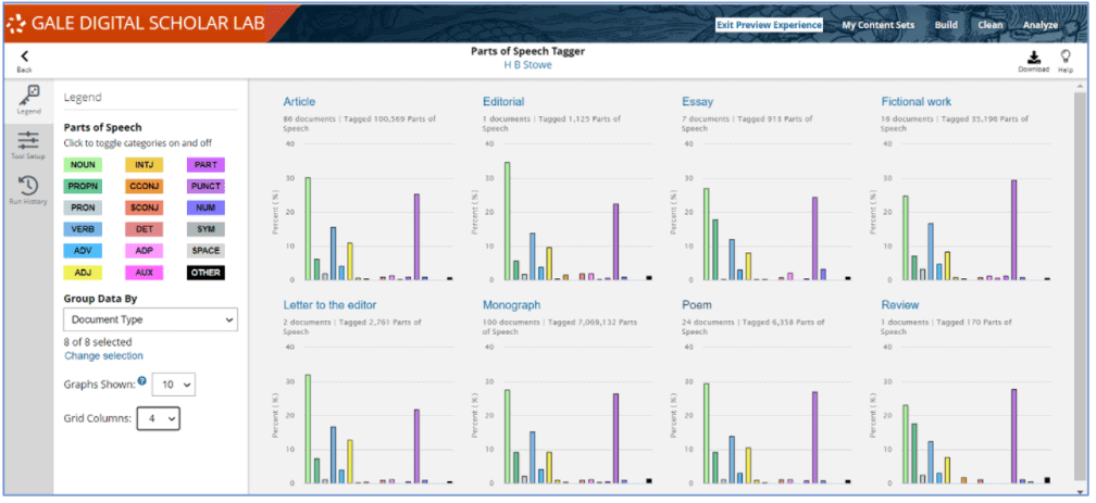
Digital resources are vital to conducting academic research and teaching the next generation of scholars. As educators, teaching with technology can be daunting. In my previous blog posts PhDing in a Pandemic: The Impact of COVID-19 on Research and Teaching and Top 10 Tips for Teaching with Primary Sources, I’ve written about how you can help students get to grips with using a range of Gale Primary Sources including Eighteenth Century Collections Online, Burney Newspapers, and British Literary Manuscripts Online. But how do you help your students take the next step as digital humanists in a growing discipline? Teaching them how to use an innovative resource such as Gale Digital Scholar Lab is one way which you as an educator can help students develop their research skills and methodologies in a changing scholarly landscape.

