
│By Emily Priest, Digital Marketing Masters student at the University of Portsmouth│
At first glance, data visualisation and Digital Humanities can seem complex and technical, but both offer significant possibilities to students, researchers and business professionals (the latter is also significant to students, as many are interested in increasing their future employability!) Whilst you may not feel particularly familiar with these terms, the data revolution is already here! So, buckle up and join me as we take a ride through the history and current applications of data visualisation and Digital Humanities!
Simplistically, data visualisation is the use of graphics and images to present data sets. Common examples include pie charts, word clouds and line graphs. Over the years, these visualisation techniques have become increasingly common – and increasingly complex. Whilst they have contributed to the emerging discipline of Digital Humanities, the term Digital Humanities refers to more than simply visualising data. Keeping Humanities at its heart, Digital Humanities leverages data visualisation to expand and deepen the traditional analysis that takes place within these disciplines.
Data Visualisation in the Enlightenment
Today, data is everywhere. According to this article from Gale’s Economist Historical Archive, “every professional interacts with data and charts, be it by pouring over a spreadsheet, watching a PowerPoint presentation or reading a newspaper”. However, although we may see it as an attribute of modern society, data visualisation is not new: it can be charted back to the mid-1600s when Flemish astronomer, Michael Florent Van Langren, is believed to have created the first visual representation of statistics.
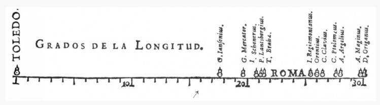
A one-dimensional line graph, it displayed the twelve known estimates of the difference in longitude between Toledo and Rome. Alongside these estimates was the name of the astronomer who provided them. Although this information could have been displayed in a table, the use of visualisation enabled greater understanding of the data at hand and “allows people to spot patterns, anomalies, proportions and relationships ”.
Victorian Visualisation
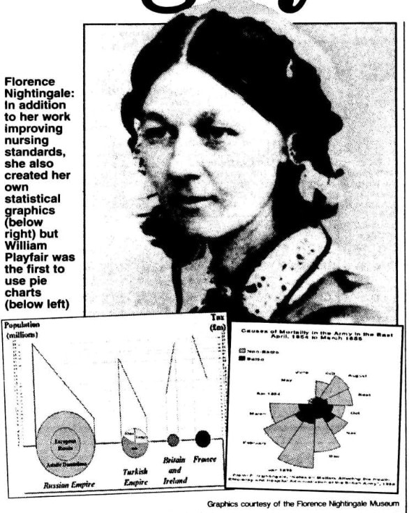
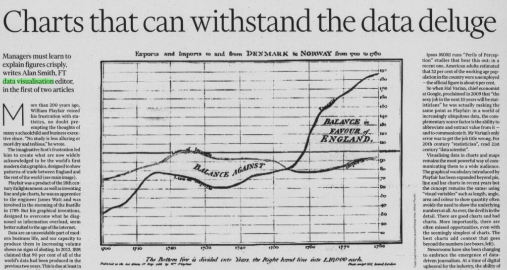
It was not until the Victorian Era that data visualisation – otherwise called thematic mapping – saw significant development. As the Industrial Revolution rolled out, iron and steam were not the only things changing society! In these years, data visualisation was adopted by geological, medical, and economical industries and in 1821 the line, bar, circle and pie charts were invented by William Playfair. Florence Nightingale also adopted the practice and it was this skill that saw her elected in 1858 as the first female member of the Statistical Society.
Laurence, Sue, et al. “Nursing by numbers.” Daily Mail, 6 Apr. 2004, p. 70. Daily Mail Historical Archive, 1896-2004, https://link.gale.com/apps/doc/EE1860101721/GDCS?u=webdemo&sid=GDCS&xid=f5499113
Premature Development
Although the Victorian Era saw the growth of data visualisation, the practice didn’t make it into the mainstream; for years it was only used and developed by a select few. This article from 1976, found in The Times Digital Archive, explains that there had been a “rediscovery of the graphic design techniques used by Victorian newspapers”. But this begs the question – why the rediscovery? Cars, also developed in the Victorian Era, had advanced and become widely accessible yet data visualisation, and our understanding of and relationship with data, had remained largely undeveloped. Why?
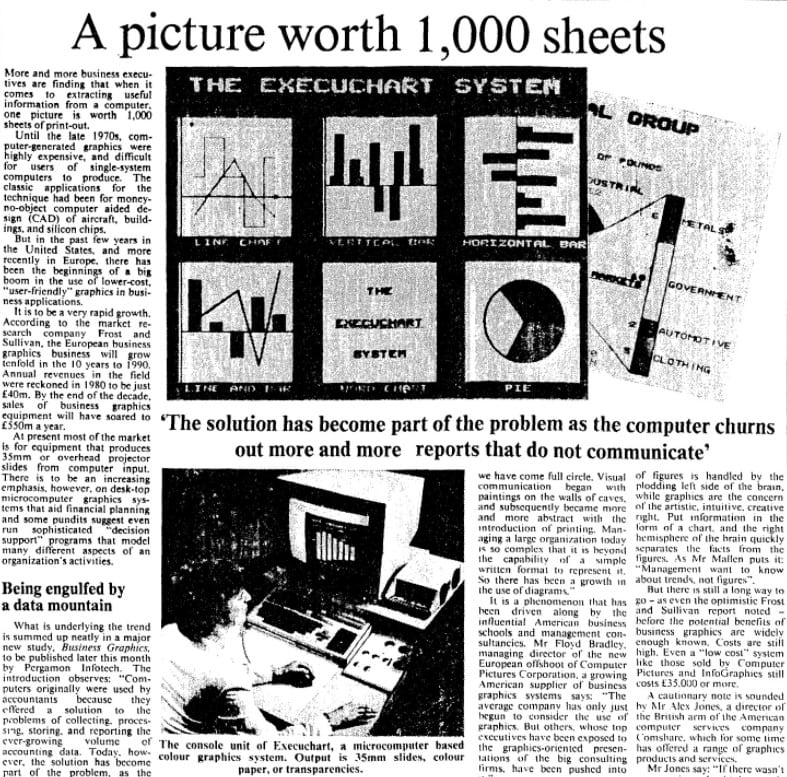
For years, processing and presenting data visually could only be done with a pen and paper. To create graphs and charts by hand, with enormous amounts of data, was a long and gruelling task and only those skilled in statistics or maths could do so effectively. Even when computers were invented, visualisation was not immediately commonplace. According to one article in The Times in 1982, in the 1970s graphics were expensive to create and mainstream technology did not yet have the processing capabilities required for data visualisation.
It seems the concept of data visualisation had come too soon for implementation.
Enter Digital Humanities
Whilst data visualisation was struggling to get off the ground, Digital Humanities had started to emerge. In the late 1940s an Italian priest, Roberto Busa, used IBM’s mainframes to analyse the works of St Thomas Aquinas. From this, he created the ground-breaking Index Thomisticus and helped to start a new data revolution in the Humanities. It is important to highlight the importance of technology in enabling his work; without the use of IBM’s advanced facilities, Busa would not have been able to complete his pioneering work and kick-start Digital Humanities. So, we find a similar situation to the development of data visualisation: breakthroughs were only made with the necessary technological support. Those who did not have access to high powered equipment would go without for many more years.
For the Few, Not the Many
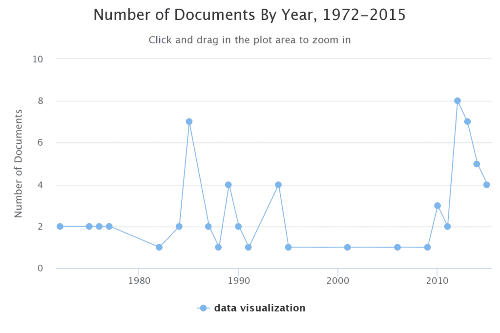
The graph above is produced by the Term Frequency tool in Gale Primary Sources and shows the frequency of the term “data visualisation”. The first spike in frequency is in 1985. Significantly, this was the year that Windows 1.0 was launched and visualisation technology quickly began to develop. Interestingly, something else was shaking the data visualisation landscape at that time – artists. This article from The Times in 1985 reports on a new initiative at the Royal College of Art in London which merged “British inventiveness and creativity”: design students were being trained in not only art and design but the craft of data visualisation. After they graduated, the article reports that these designers received well-paid jobs “overseas” in various industries from retail to marketing.
However, despite technology and education showing new interest in and accommodating data visualisation, a year later we can see a decline in use of the term “data visualisation” on the Term Frequency graph. Digging into this, I found one article from 1989 titled “Power to the Desktop” in which the author asks “where are the applications to exploit that power?” According to the writer, whilst the necessary processing power was becoming ever possible with the introduction of the PC, there were no everyday applications at the time which could analyse and visualize large pools of data. At least, not easily, quickly or affordably.
“The answer”, the author writes, “may well be a third wave of software development”.
When would this third wave come?
The Third Wave Cometh
I would argue that it was 20 years later, in the late 00’s, that the Third Wave finally arrived.
At an increasing pace, in came social media, streaming platforms, faster and faster internet, international trade, smartphones, AI and much more. Refined and multi-faceted third-party applications had become mainstream and with them came the total adoption of data visualisation in our everyday lives. The use of graphics, in the news particularly, to relay complex facts or statistics to the general public, has boomed. Before we knew it, data visualisations permeates the media, describing election results, pandemic growth, car sales, wage increases and more. “New technologies like cloud and big data,” wrote an advert for New Scientist in The Economist in 2013, “are transforming the way that business [was] undertaken”. However, it was more than just business that has transformed.
The Visual Future of Research
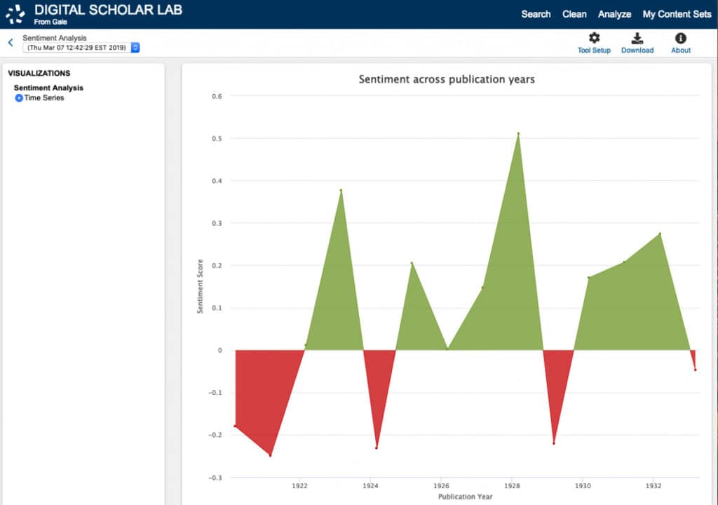
In the early 2010s, scholars had also started to increasingly “interact with coders and website designers to make their research more accessible and data publicly available”. It was also around this time that Gale began receiving requests from researchers and theorists to access the underlying data of their archives, including metadata and OCR, for the purpose of text mining. Seeing a need, Gale began to develop user-friendly visualisation tools on their platforms, including Term Frequency and Topic Finder features, and started to pioneer research in the modern day to accommodate new search functions, readability, cross-referencing and text mining across their archives. Because of these features it is now possible to analyse entire archives in ways that 20 years ago would have been almost impossible.
A few years later, in 2018, Gale launched the Gale Digital Scholar Lab – one of the first ready-made platforms to integrate rich data and powerful tools, allowing students and scholars to easily conduct DH analysis and create visualisations. A cloud-based platform, it enables students and researchers to search, analyse and text mine Gale Primary Sources. The Lab also allows the user to build custom-curated content sets, organise research easily in one place and export data for further analysis, removing the barriers that deter many from conducting DH research. With little training anyone can use the Lab’s features make valuable visual breakthroughs that can elevate research and knowledge.
The Data Revolution is Here
First used for charting distances, data visualisation (and Digital Humanities!) is now ever-present in research, education, the media, business, medicine and more. The Financial Times even has a data visualisation editor!
Take a moment to consider how data visualisation benefits YOUR life, business or research… Finding data is much quicker and easier. Research is more efficient. Coming to conclusions or spotting patterns has never been easier. Relaying complex information, simply and easily, is an everyday occurrence. Sorting and presenting data can be done on a smartphone in seconds…
Undoubtedly, in a world now rooted in data, data visualisation liberates the individual of daunting “data mountains” and in doing so empowers us to do more.
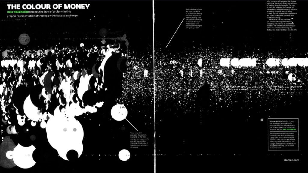
“The Colour of Money.” FT Weekend Magazine. Financial Times, July 27-28 2013. Financial Times Historical Archive, https://link.gale.com/apps/doc/KLQIAQ316432675/GDCS?u=webdemo&sid=GDCS&xid=bbfae6d9
Want to read more about what students have done with the Gale Digital Scholar Lab? Check out this post in which a Gale Ambassador interviews students at the University of Helsinki who used the Lab in their studies.
Or love reading about the evolution of technology? Check out “Video Games as Learning tools” or “The Rise and Fall of Space Invaders in the British Press“
Blog post cover image citation: From Lukas Blazek @goumbik on Unsplash https://unsplash.com/photos/mcSDtbWXUZU