│By Sarah L. Ketchley, Senior Digital Humanities Specialist│
Of the six tools in Gale Digital Scholar Lab, clustering is often considered the most challenging methodology to interpret effectively. This blog post will explore the nature of this analysis tool and offer some tips for running an analysis.
Why Clustering?
Clustering is a type of exploratory data analysis that uses distant reading techniques to interpret the connections in collections of text documents, which can reveal features of interest that are not likely visible through traditional close reading. It’s a good starting point when initially approaching a content set to figure out trends and themes within the collection. The tool enables the comparison of texts by clustering them around particular features or attributes.
The implementation in the Lab is built using the open-source Scikit-Learn’s K-means clustering algorithm, and the graphic displaying the analysis results is a scatter plot that represents how close or distant documents are within a content set.
How Does It Work?
There are a couple of primary training or analysis methodologies in machine learning. For tools that are trained using Supervised Learning techniques, you essentially feed the program labelled data. In other words, you train the algorithm on data where the correct answers are provided, then apply the learned rules to new data to predict their answers. Parts of Speech and Named Entity Recognition are good examples of this.
Clustering, however, is categorised as Unsupervised Learning, so there are no labels supplied for the data, and it is up to the program to discover them. This methodology is useful for discovering hidden patterns in data and arranging them in clusters.
The k-means clustering algorithm used in the Lab designates k as the number of clusters chosen by the researcher.
As the algorithm begins working, it chooses k–random points as centroids and assigns the remaining data points to the closest centroid. Once all the points are assigned, a new mean for the k-centroids is calculated, and some data points might consequently be reassigned to a different centroid. The algorithm stops its work when this re-assignment no longer changes.
The K-Means clustering algorithm is insensitive to very small differences but quite sensitive to outliers and extreme values – which make it harder for the centroids to play their part. So, as the examples below show, we’ll sometimes see extreme values or outliers quite obviously displayed after the K-Means algorithm has finished processing.
What’s the Output?
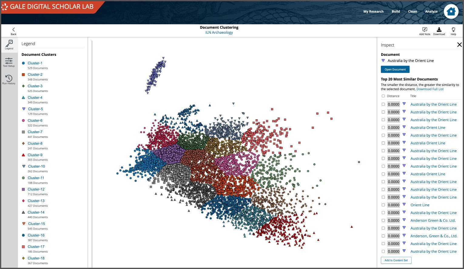
The clustering tool produces a single scatter plot visualisation as its output, plotting data points according to x and y coordinates. It permits downloading of tabular data in CSV and JSON formats, document metadata in JSON format, and static visualisation images as PNG, SVG, PDF and JPEG.

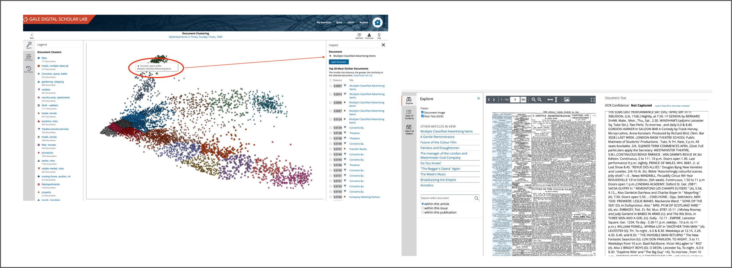
The visualisation represents how close or distant individual documents are to one another in a Content Set. The proximity between points shows how similar they are to one another; texts that are more similar group or “cluster” together. It is also interactive – mousing over individual points in the graphic will indicate the title of the original document, and clicking on the title will open a side panel showing the chosen document and the top 20 most similar documents, with their relative similarity distance from the initial document.
From the sidebar, a user can open the original document and take a closer look at the scanned image and OCR text output. This close reading enables the user to make informed decisions about how they wish to work with their content set, for example, they may decide to segment sub-sets of data into a new content set for further analysis based on their assessment of the clustering results.
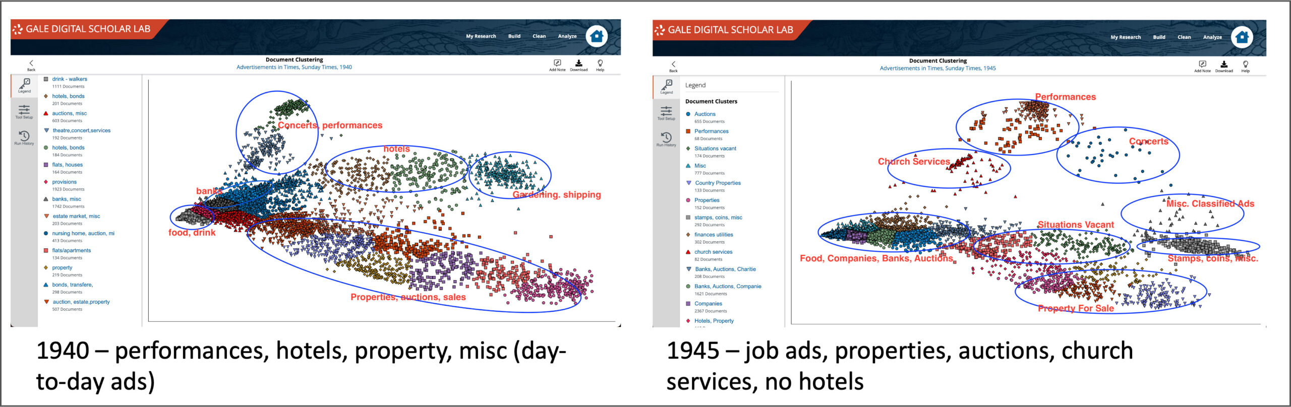
Case Study: How Does Advertising in The Times Change Between the Start and the End of World War II?
Here’s an example of a research question using comparative analysis between two content sets from The Times Digital Archive, looking at how advertising changed over the course of the World War II.* One collection of texts contains newspaper advertisements from 1940, the second from 1945. Each has just over 9,000 documents in it.

The left-hand image below shows initial clustering results – twenty clusters were selected with a default clean configuration, which removes all tabs, line breaks, and normalises white space, as well as applying a basic English stop word filter to the text data. Looking closely at each cluster, the lists of document titles help discern what the connections between each clustered groups are, and each cluster can be renamed accordingly: ‘Cluster 2’ becomes ‘hotels’, ‘Cluster 3’ is ‘concerts, opera, ballet,’ and so on. The right-hand image below shows the evolution of this process, giving a broad sense of the main themes in the group of documents.
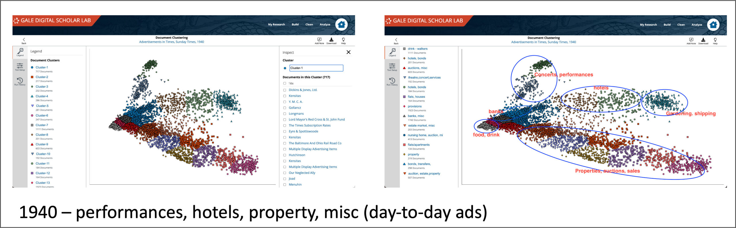
Using the same methodology on the second content set from 1945, it becomes possible to compare the output of clustering analysis of each group. Looking at the two visualisations side by side there are some obvious differences in prevalent themes – new groupings include situations vacant, church services, and a bigger cluster of banks and auctions than in 1940. The concerts and performances are more scattered, less cohesive, and notably the hotels section isn’t particularly in evidence at all.
Making Meaning and Discerning Trends
While the analysis work is slow and iterative, such side-by-side comparison of visualisations can help researchers become comfortable with the process of making meaning and discerning trends from tool output that can seem otherwise confusing or dense. The ability to switch between close- and distant-reading methodologies is a compelling feature of the workflow in Gale Digital Scholar Lab.
If you want to see an overview of the tool in action, we have a webinar available online discussing all things K-Means! It’s available here on the Gale Support site.
*the 1940/1945 Case Study is based on a suggestion by Rebecca Gillott, who conducted some of the preliminary analysis.
If you enjoyed reading this blog post, check out others in the ‘Notes from our DH Correspondent’ series, which include: